Logos with Long Company Names: Examples and Approaches
A logo using your company name is always a good way to go. However, a long company name can be a challenge for a logo designer. It can be difficult to keep a clean look to a logo using a long company name. Lengthy text can look busy and complicated. Also, the more “stuff” you add to a logo, the harder it is to be noticed at a glance. (I always think less is more in a logo – the simpler, the better.) Good logos are quickly readable. Seeing how other designers have handled this task can be helpful. Here are some examples of long corporate logos.
Horizontal long logos
These logos keep all the words on one line. Every word is set in the same size and typeface to cut down on extra busyness. (That quirky, silly lettering didn’t do any favors for PricewaterhouseCoopers. They finally threw in the towel and now do business as PwC – KEEP IT CLEAN AND SIMPLE.)

Here are a couple examples of logos designed by Sandy Hibbard Creative using text for longer company names:

Stacked long logos
Another approach is to use “letter stacking”. You can really get creative here.

Options are good
It’s common for a brand to have several “lock-ups,” or official arrangements of the logo elements. This way the right logo can be selected to fill the available space. A website header might be a good place for a long, horizontal lock-up. Maybe a stacked, centered version goes on a vertical banner at a trade show. Often the proportion between the symbol and the wordmark changes to create a harmonious, balanced grouping.
![]()
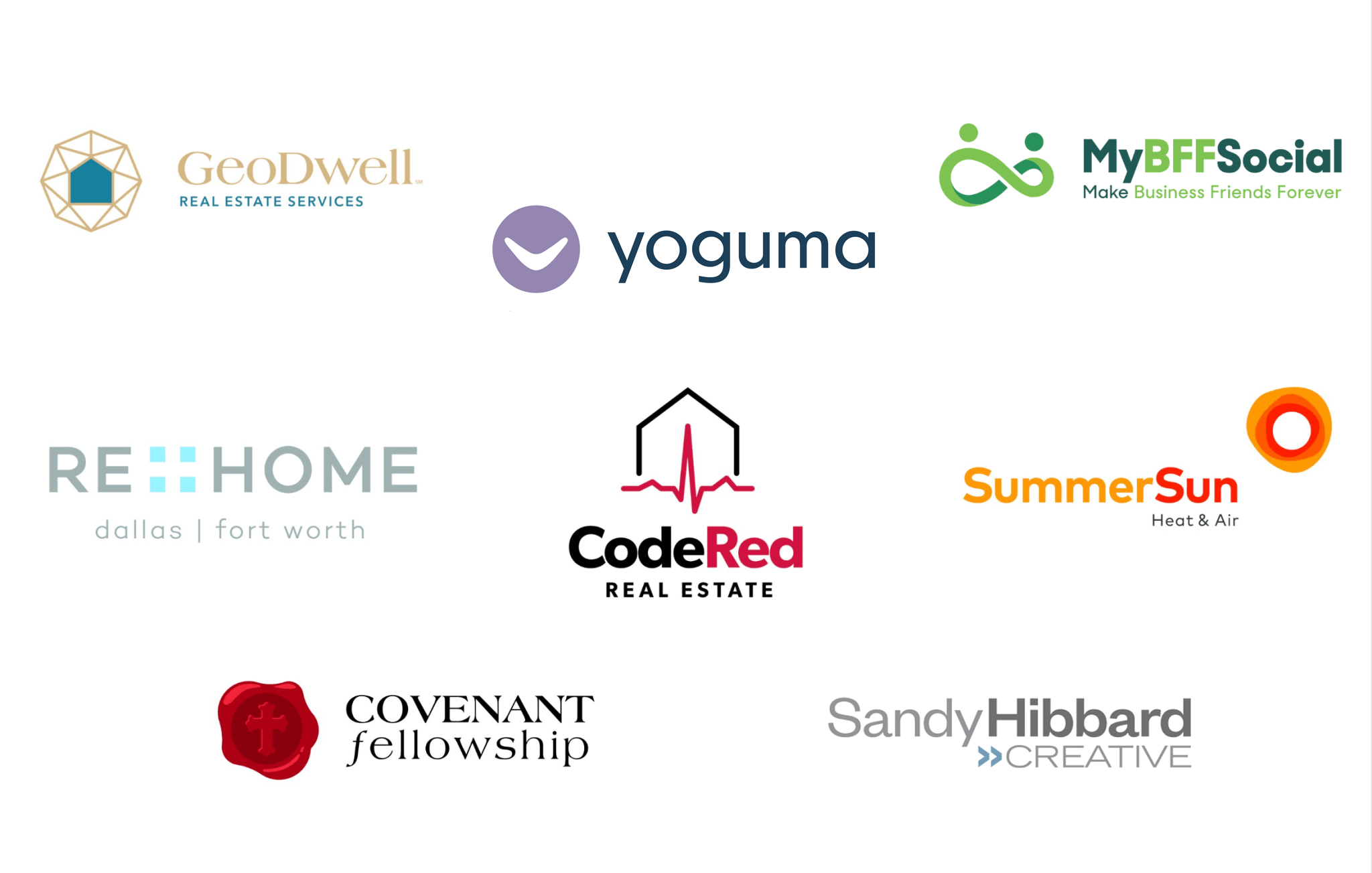
Here are examples of logos we have designed for our clients using text for the company name:

If your company needs a logo refresh, maybe I can help. Learn more about brand identity design here: 11 Tips for Developing a Brand Logo.
